BRANDING
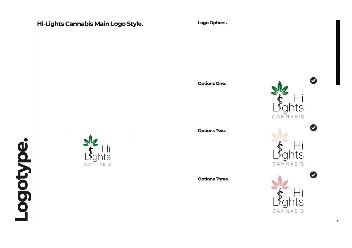
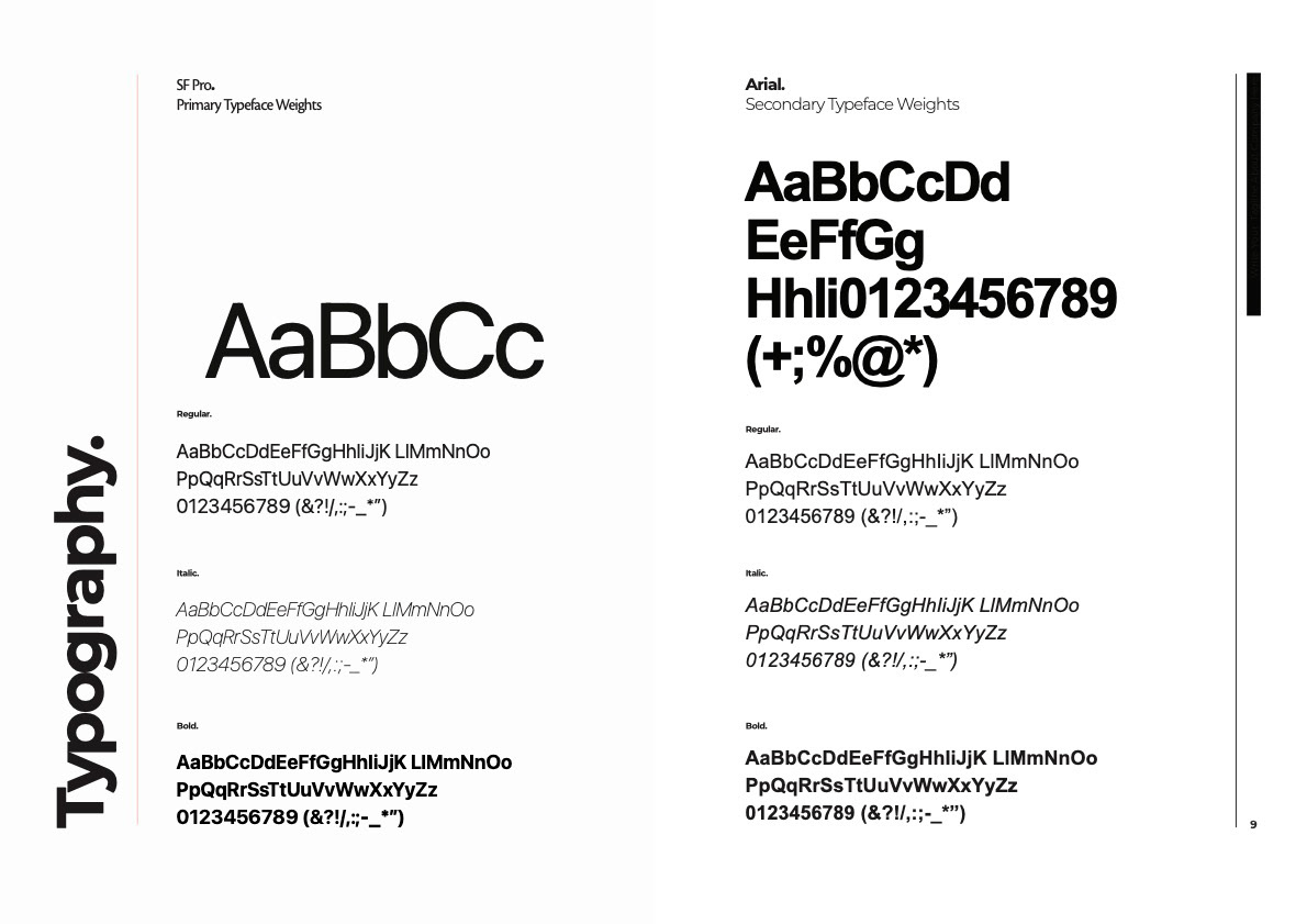
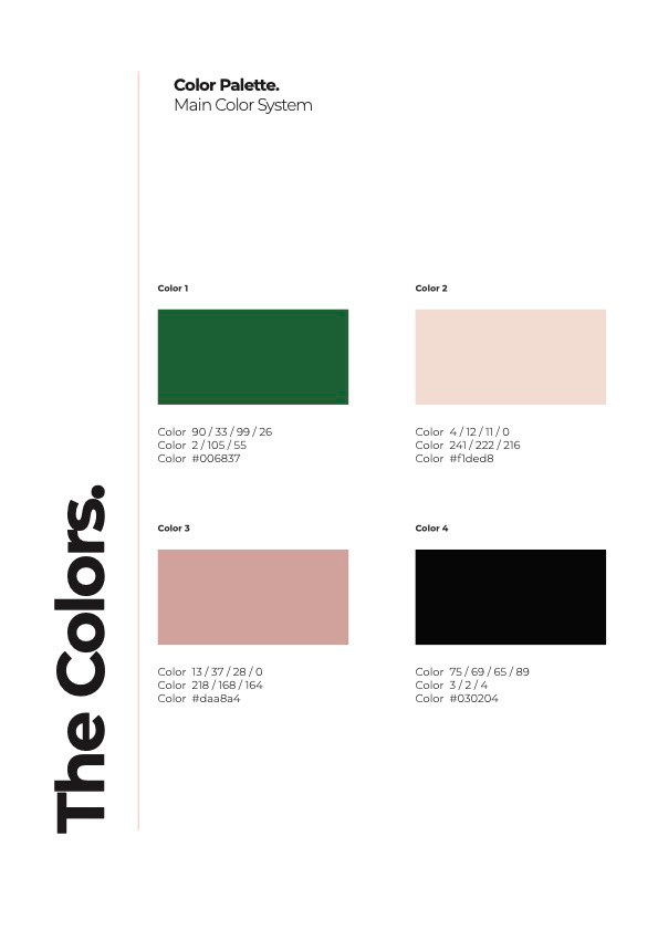
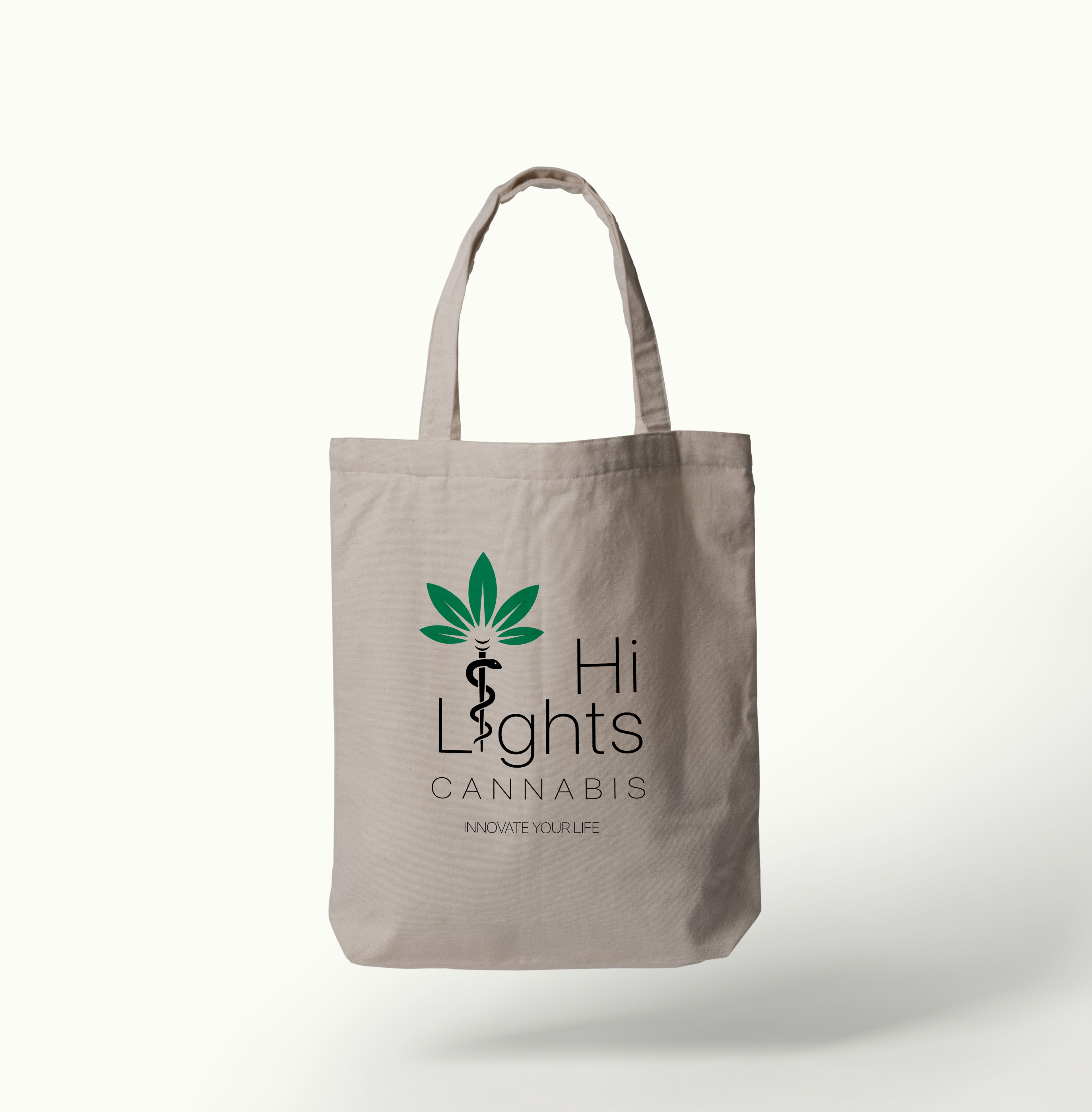
The Hi-Lights Cannabis logo came from the idea of a playful cannabis leaf combined with the medical snake to give off a sense of cannabis while still keeping the medical roots and message behind the overall brand. The colors of the brand are meant to be soft and welcoming, as again, Hi-Lights is meant to help advocate the medical benefits of cannabis use.
ADVERTISING
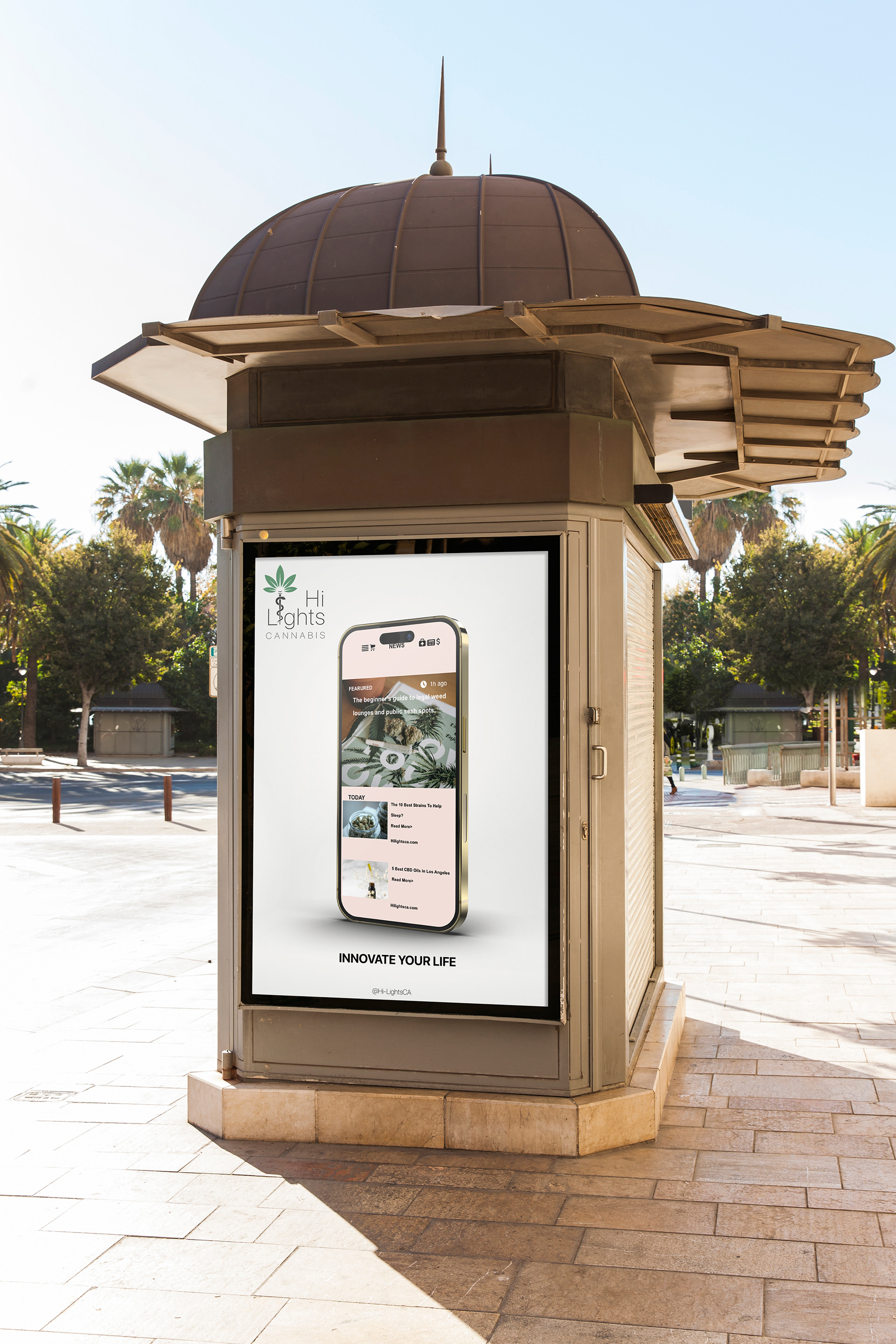
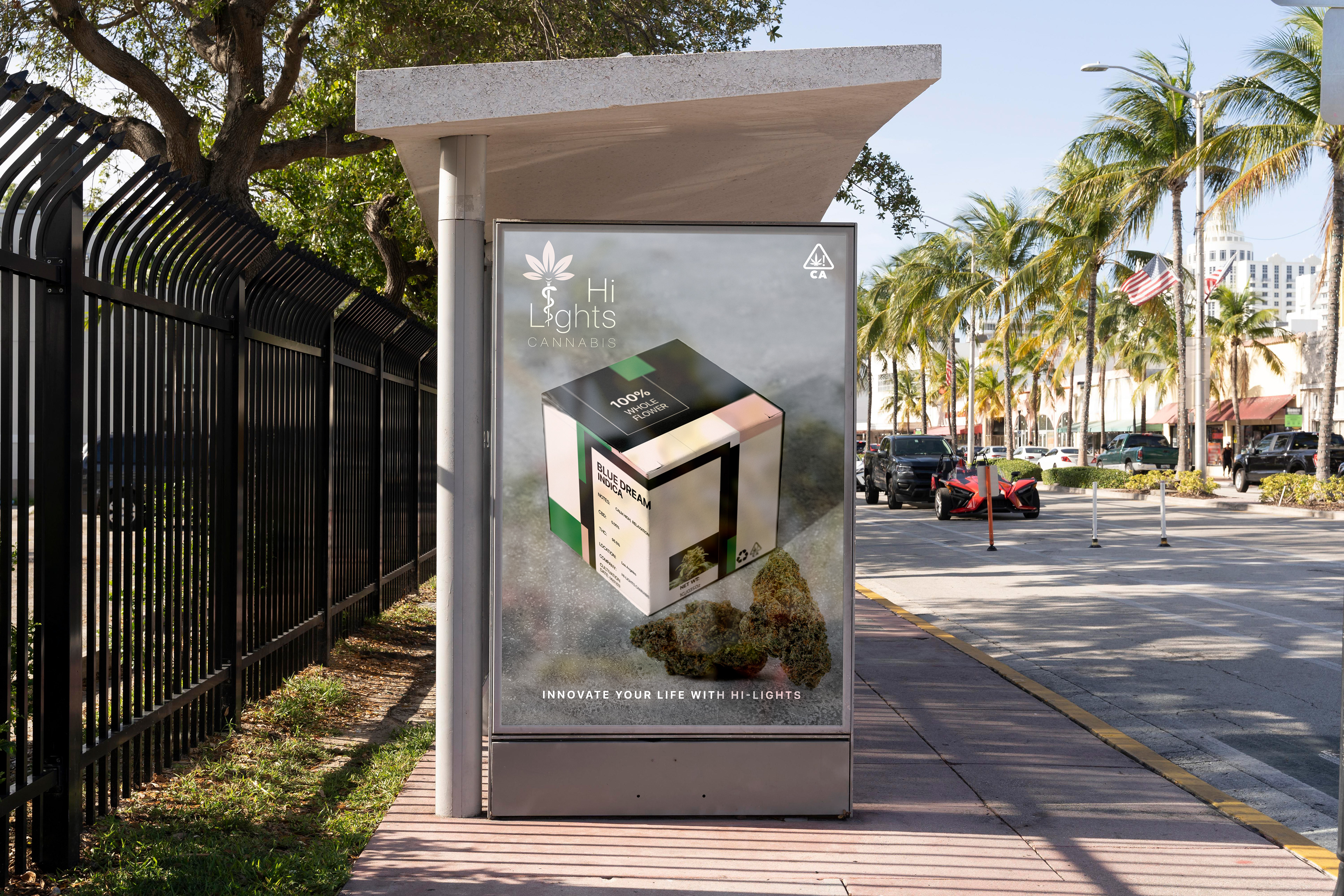
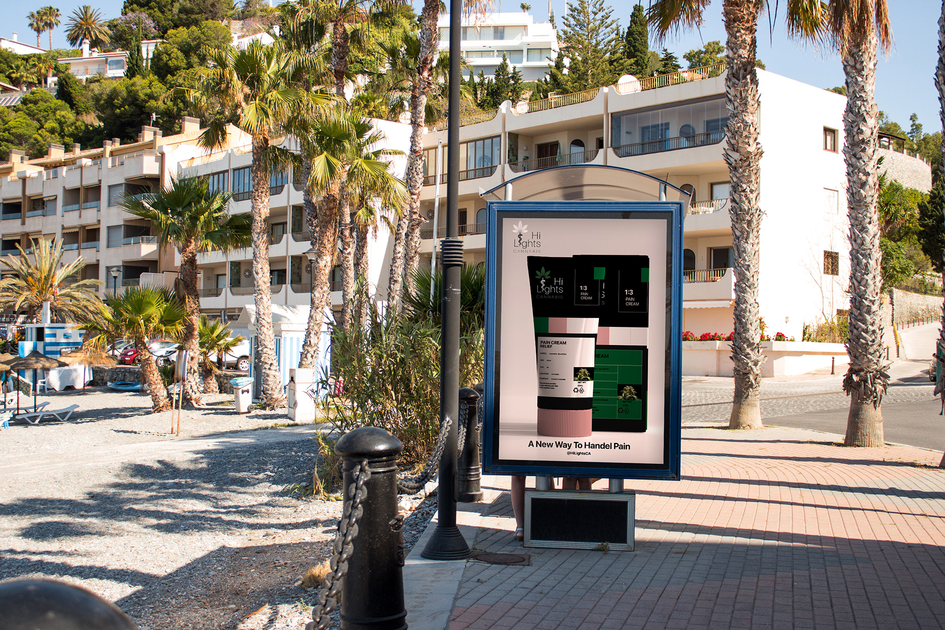
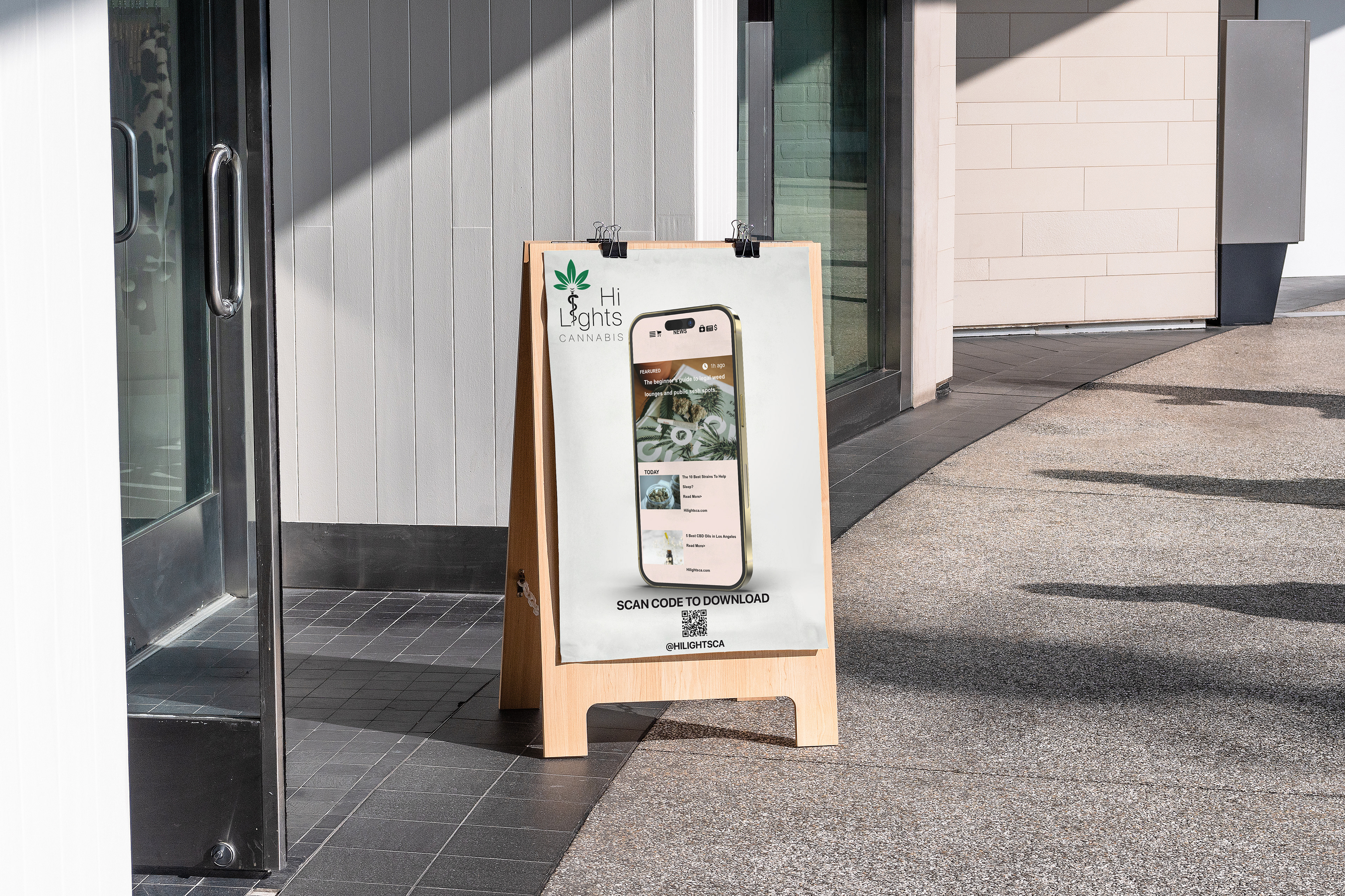
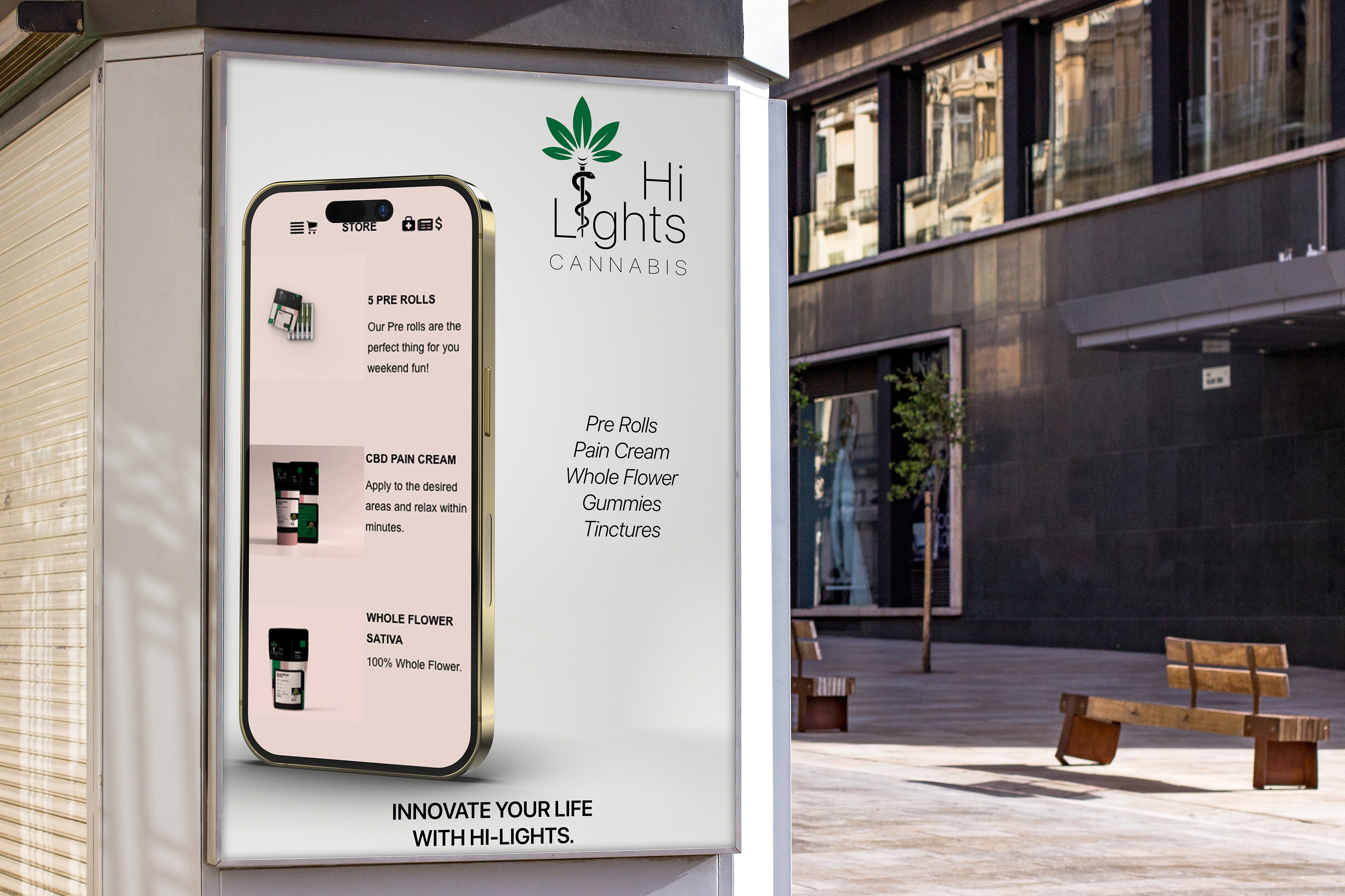
Ads were placed in areas with high foot traffic, areas that would attract all sorts of people. Hi- Lights Cannabis ads were created to appeal to everyone, not just cannabis users. Ads were created using packing and product assets as well as UX assets.
PACKAGING/PRODUCTS
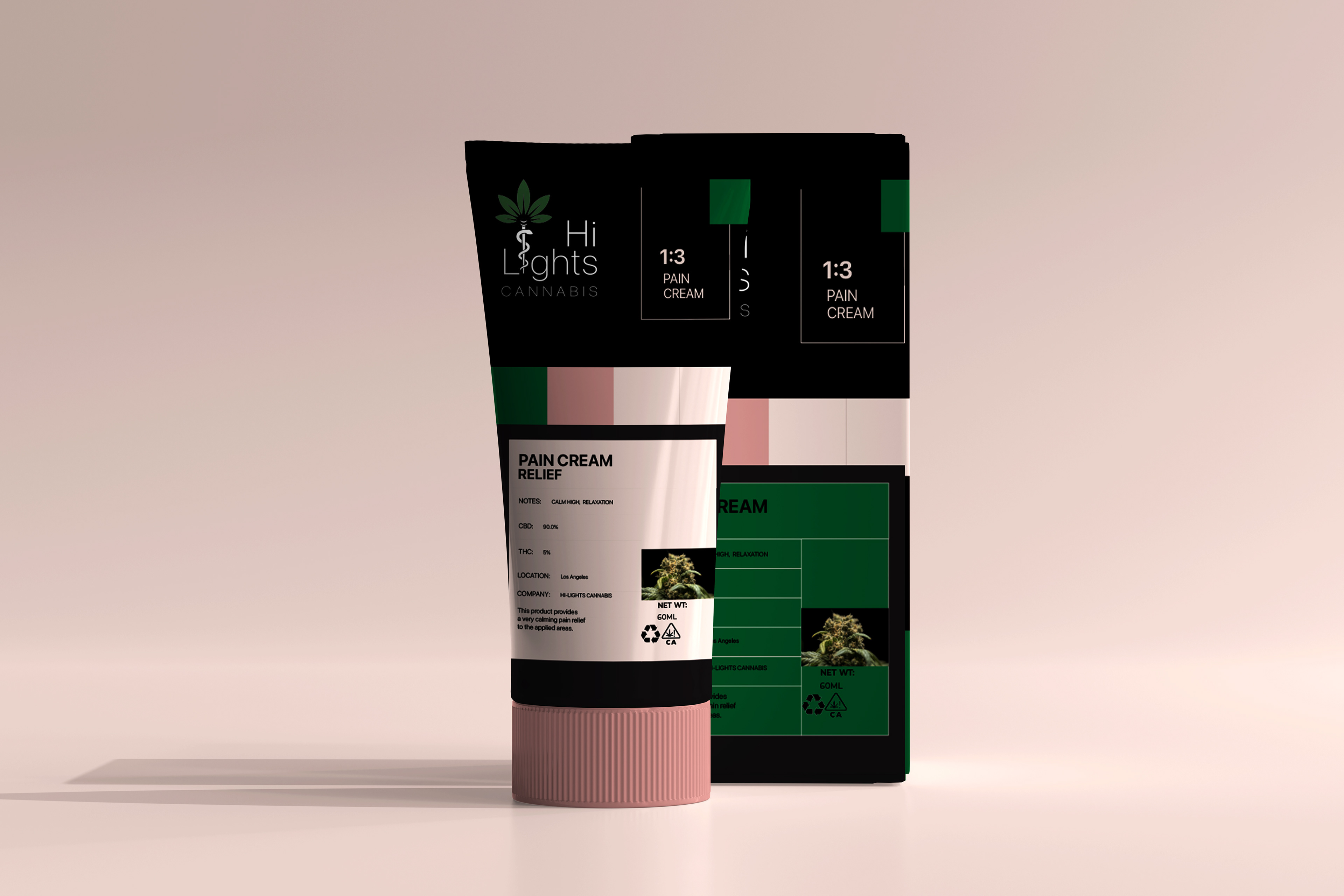
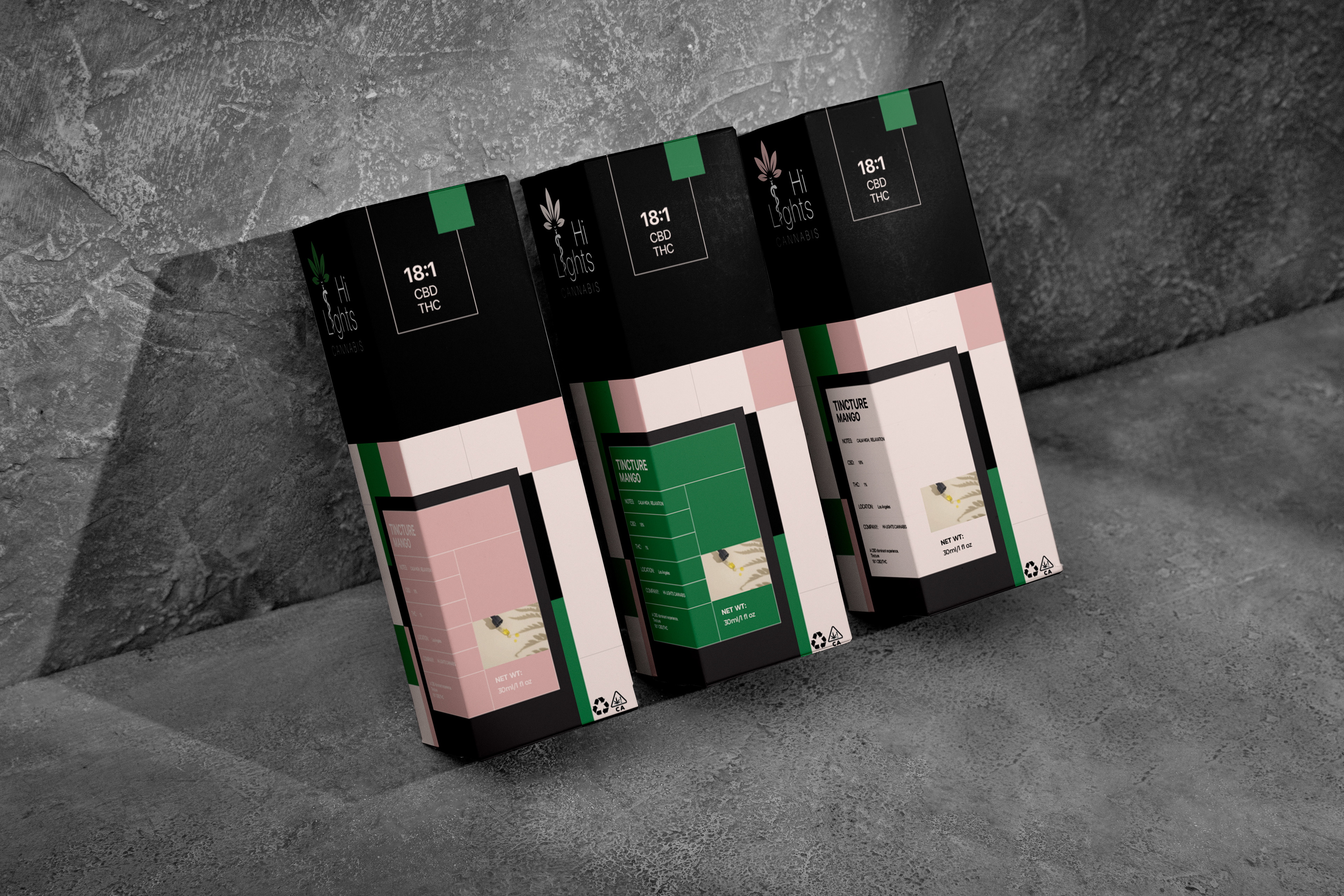
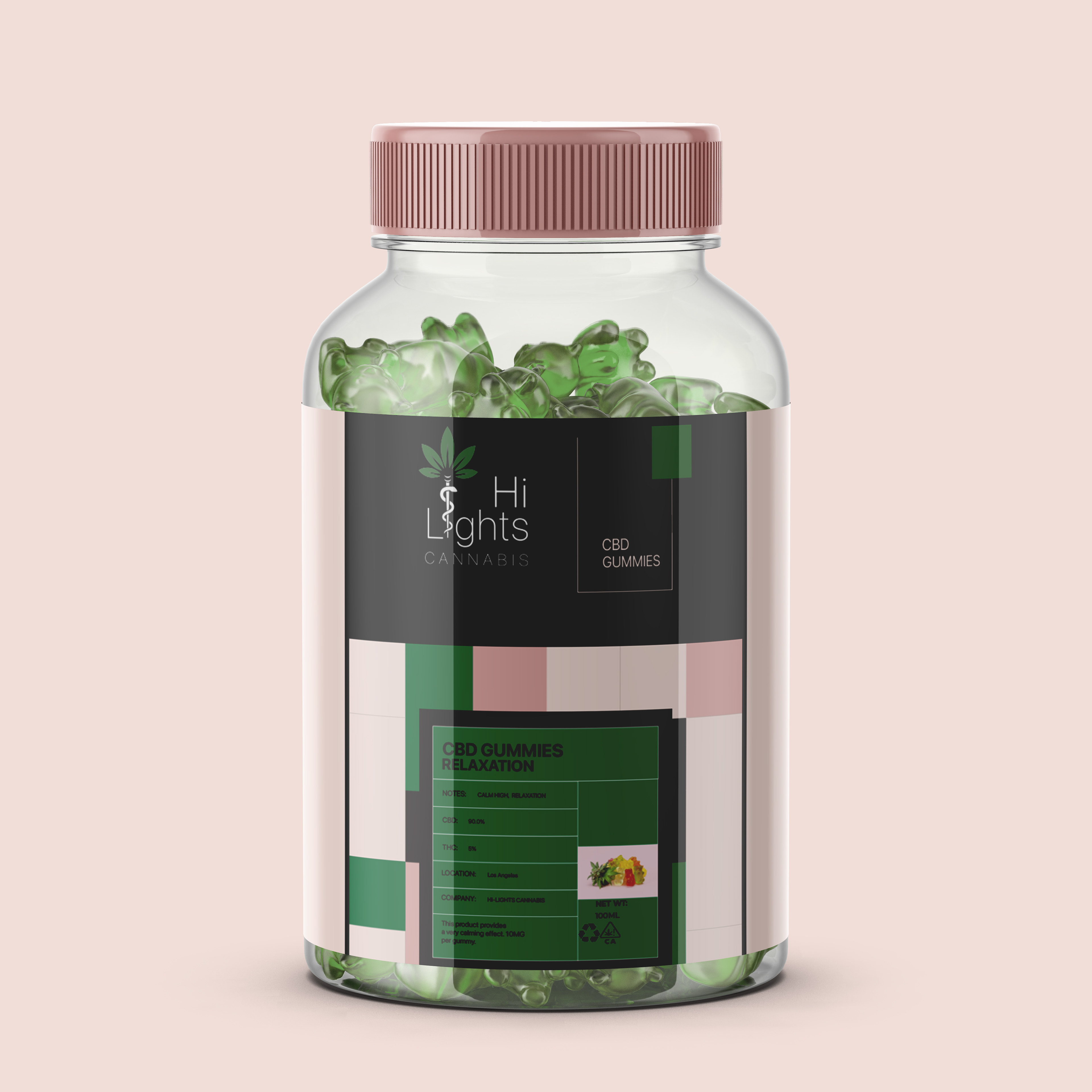
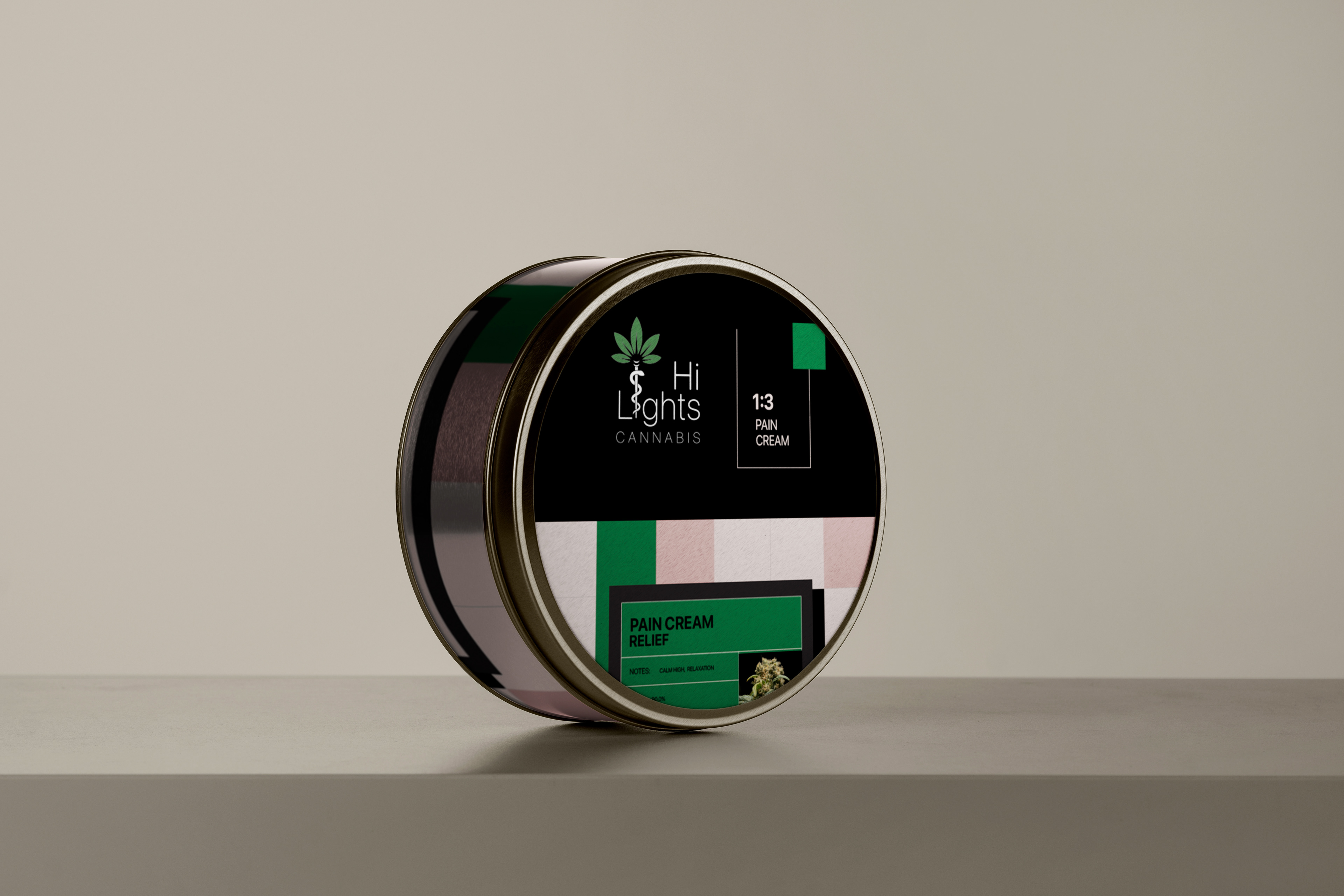
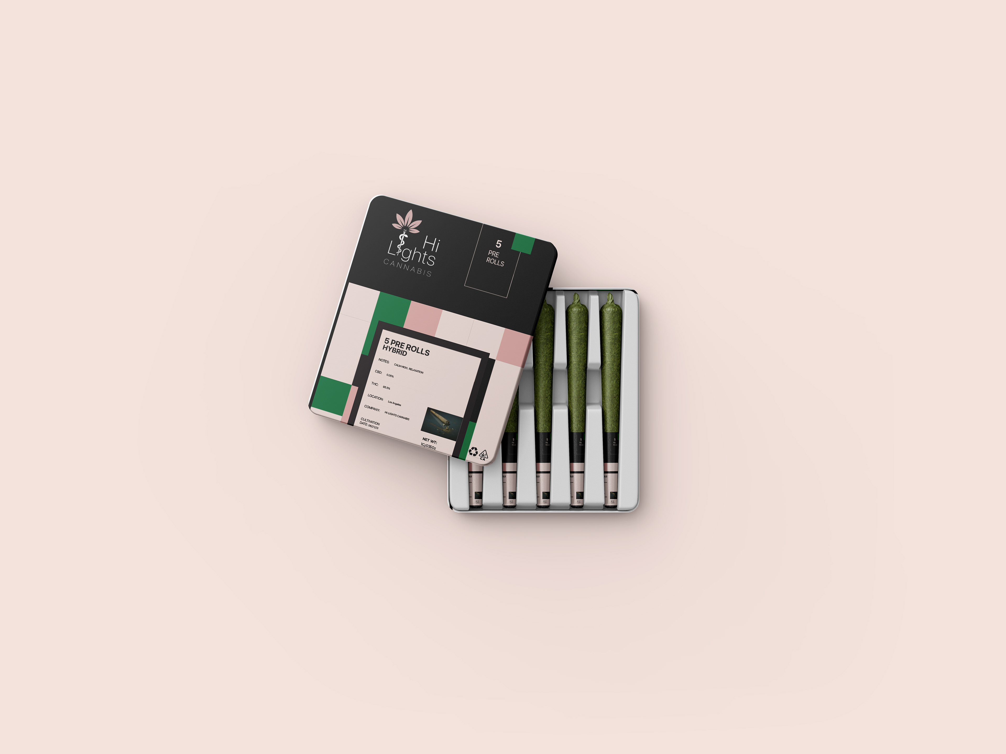
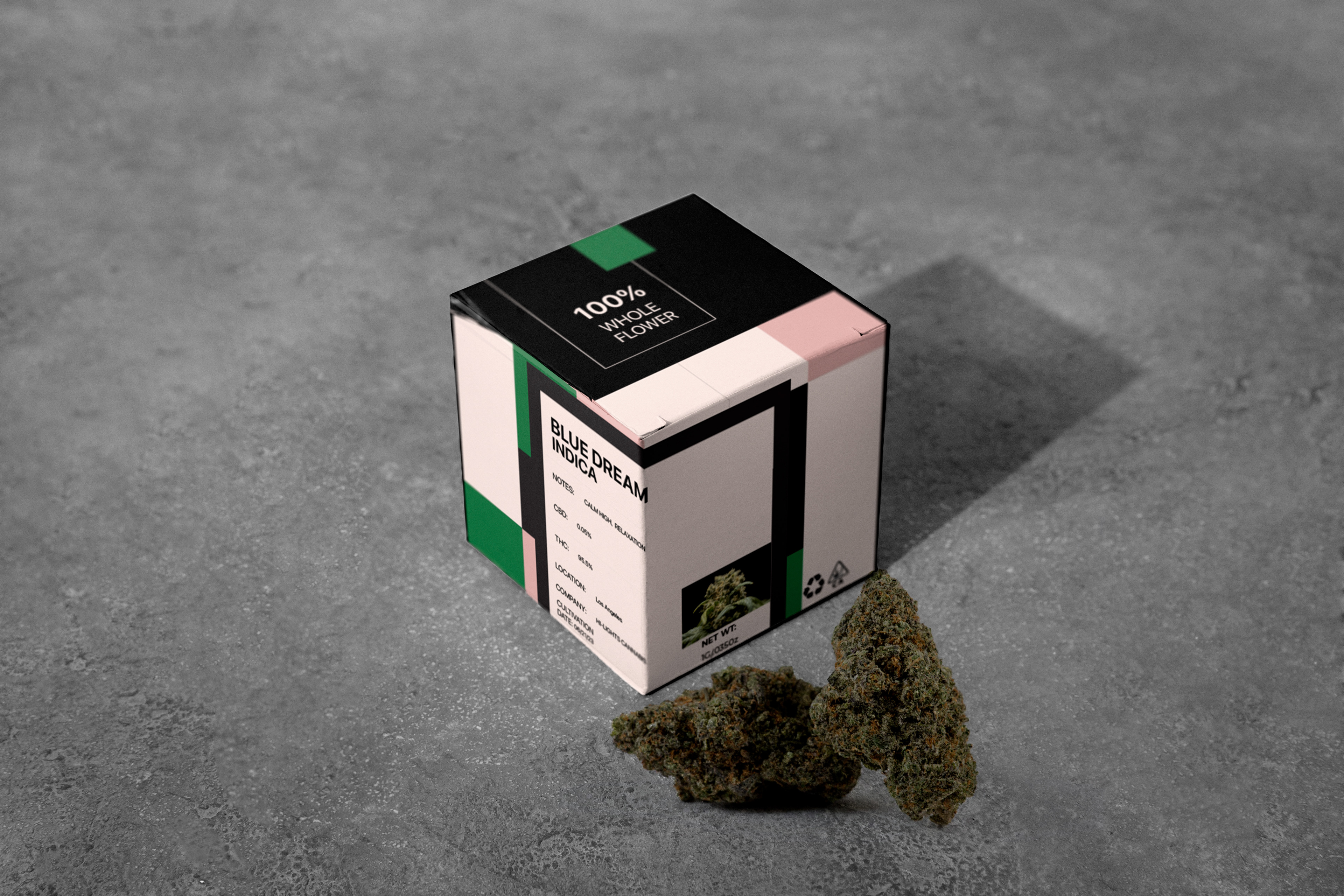
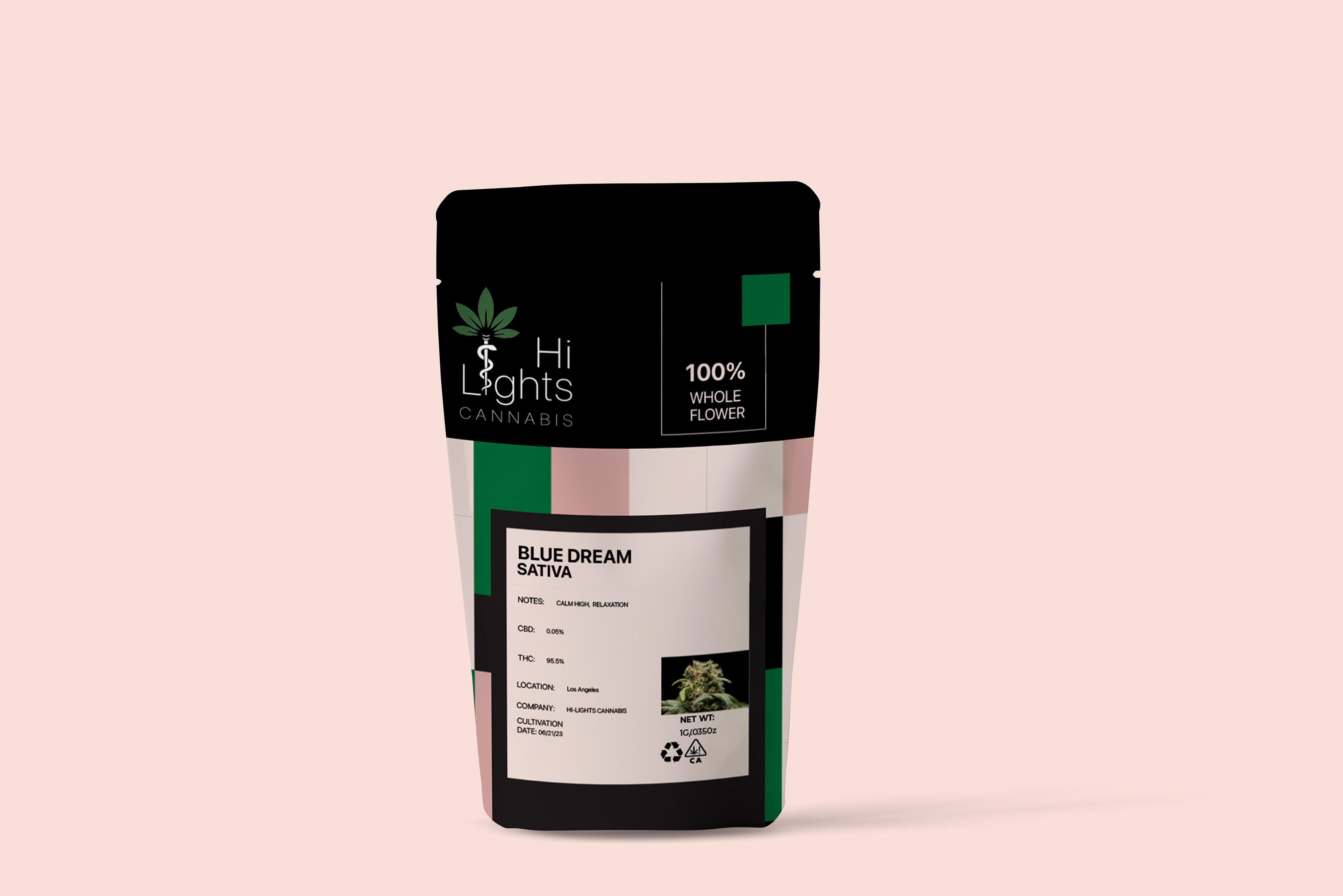
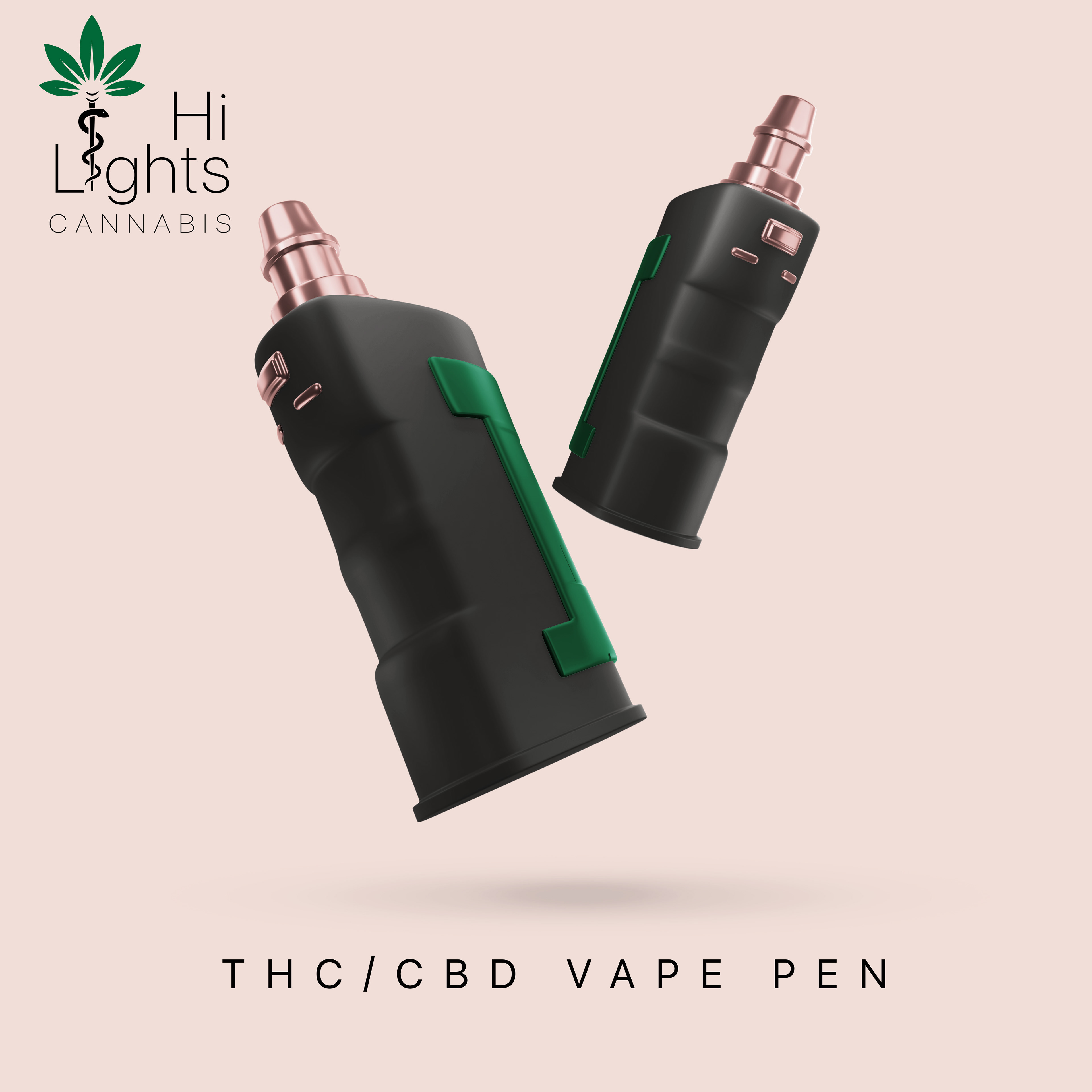
Hi-Lights Cannabis packaging was created by coming up with a cohesive design that fit some of the main cannabis products, like flowers, pre-rolls, gummies, edibles, tinctures, and vapes, as well as more THC and CBD products. The labels for all packaging were created using Adobe Illustrator and then transferred over and placed onto mockups in Photoshop.
UX
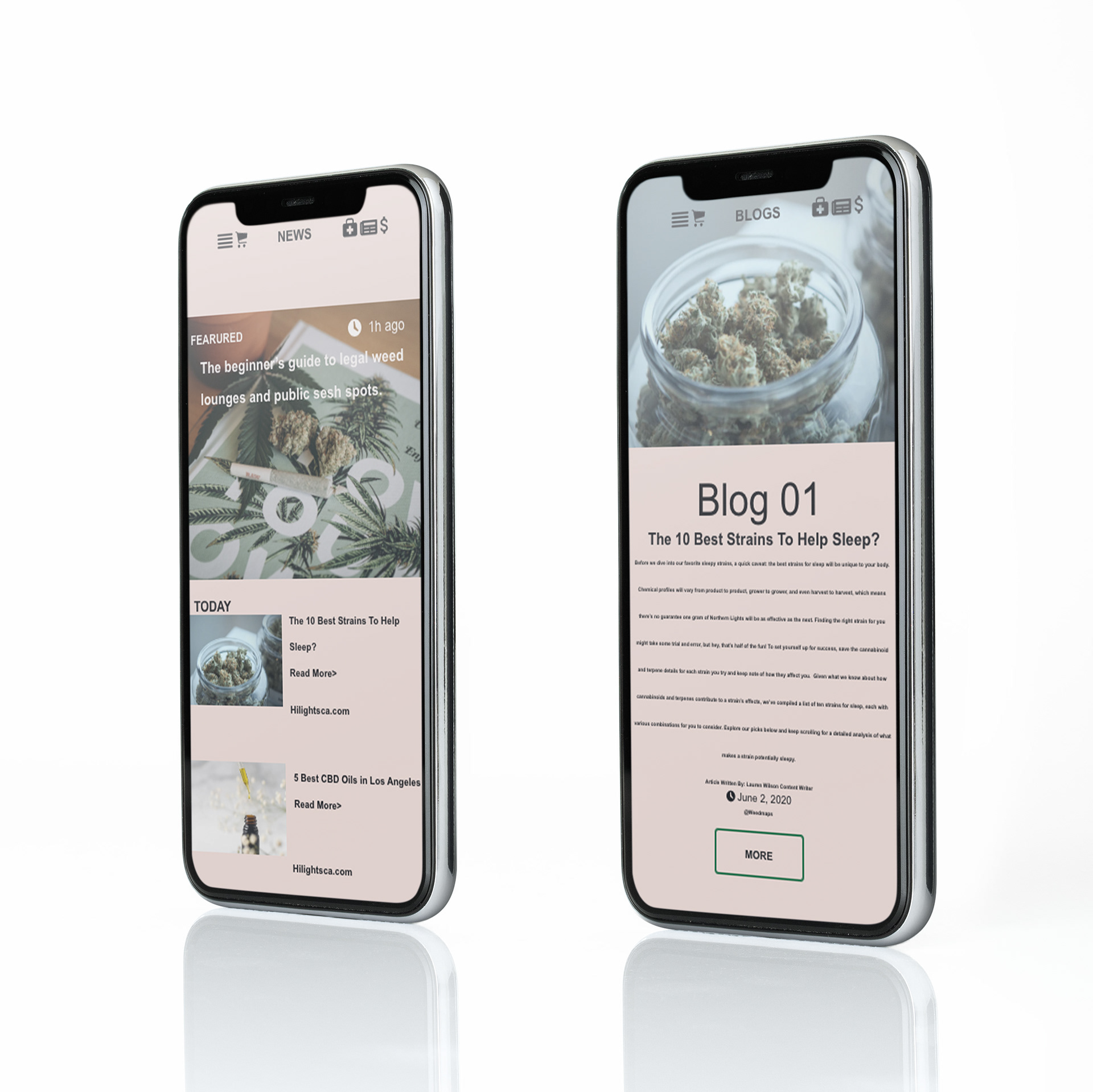
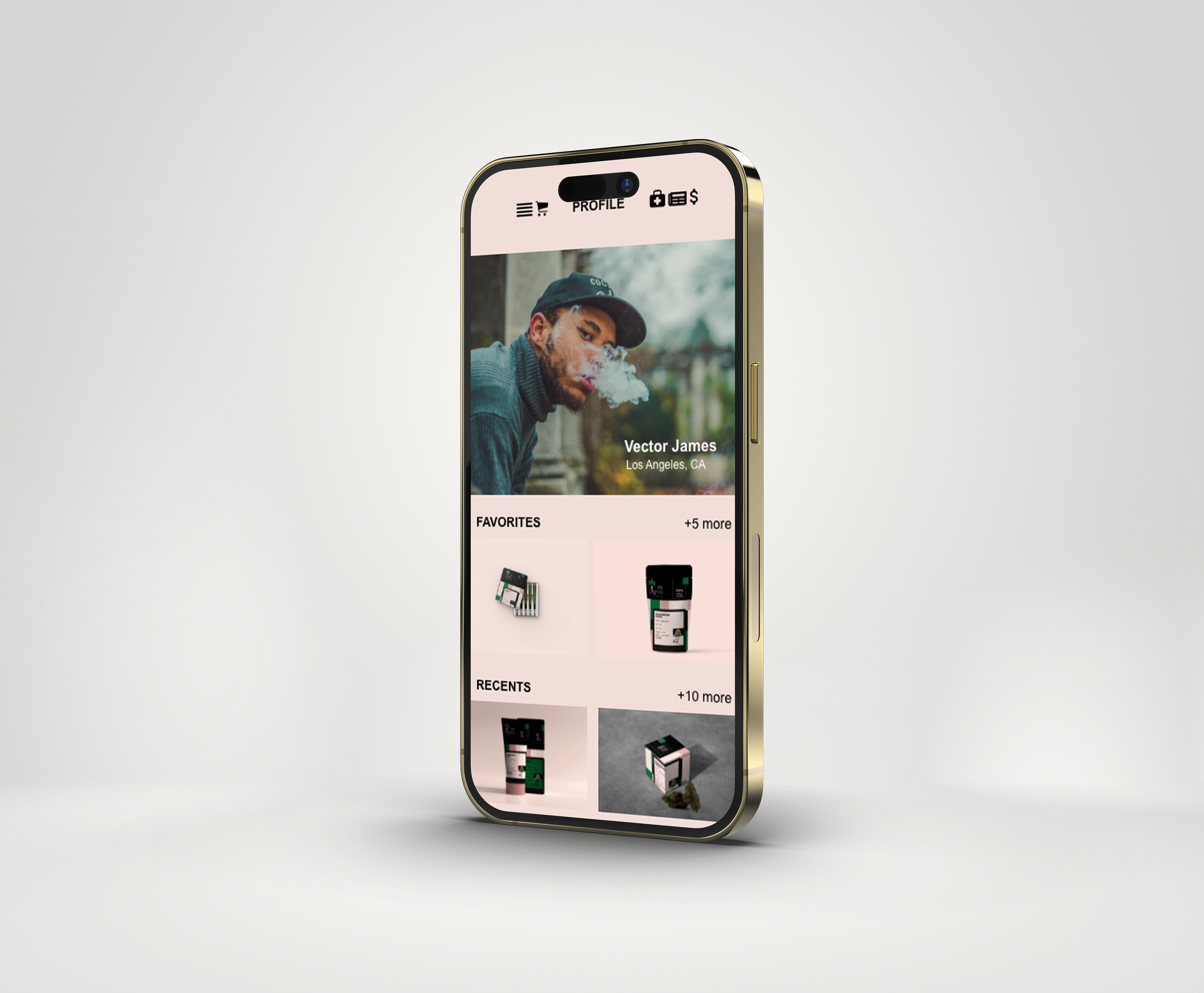
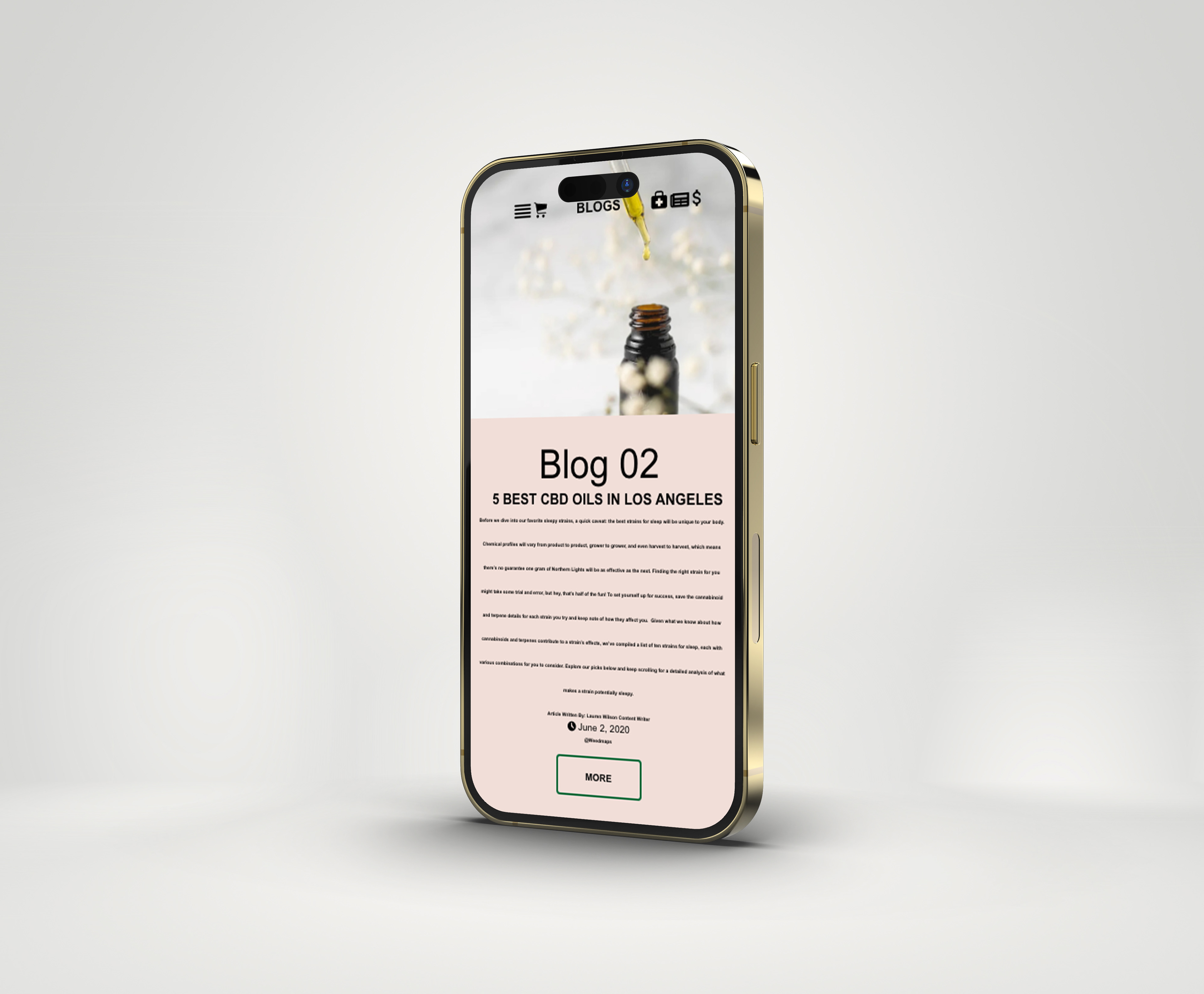
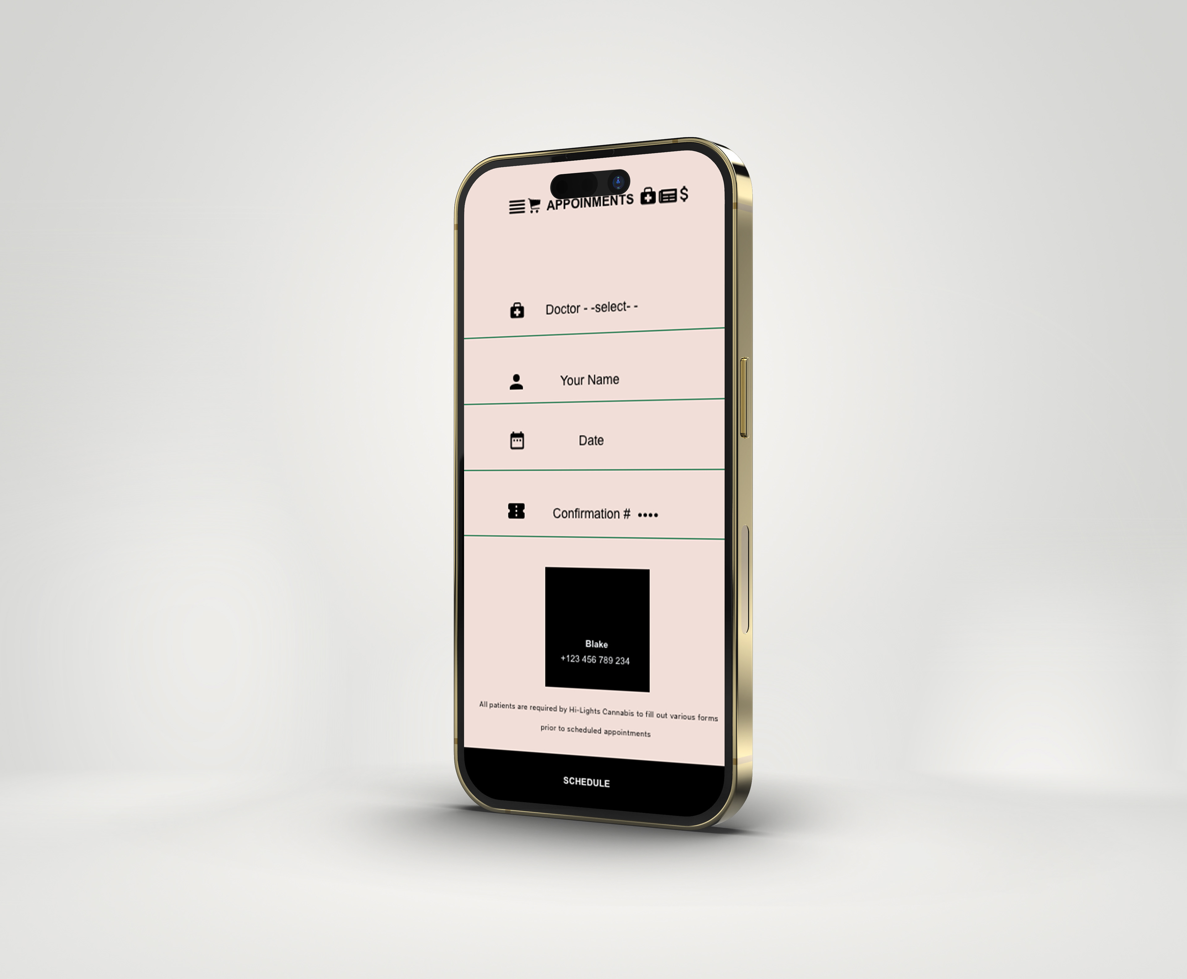
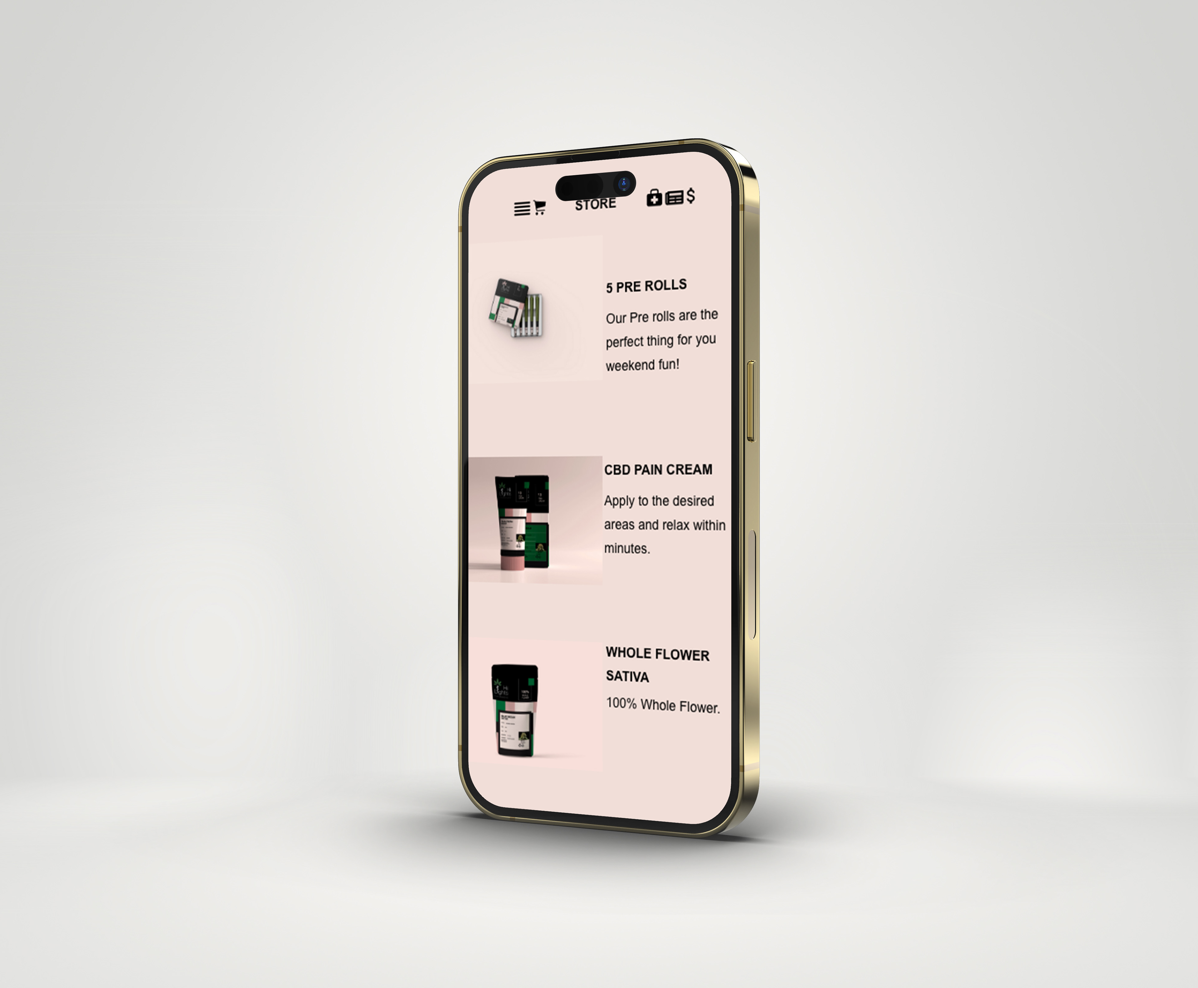
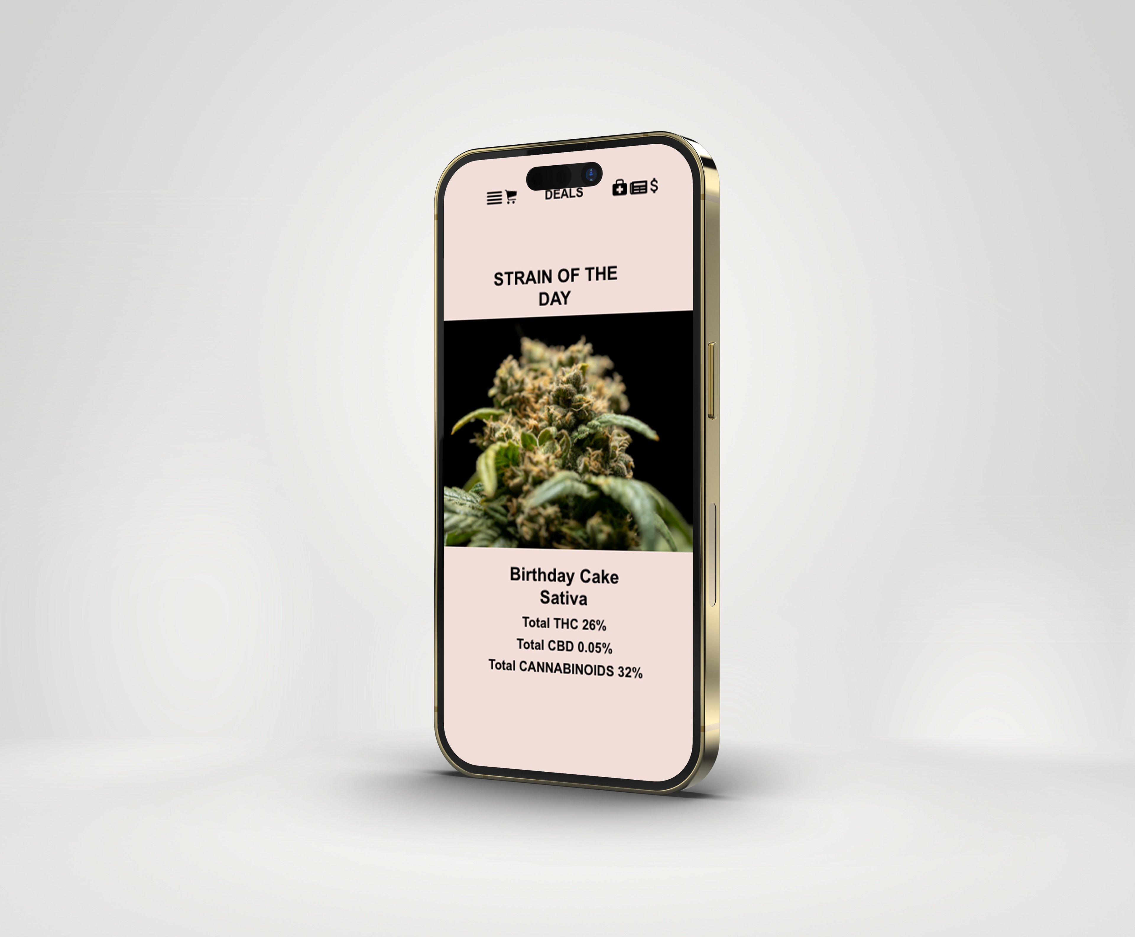
For the app, I really wanted to push the narrative of medical marijuana and give users something they could use besides just ordering it. With that being said, you will find things like cannabis news, cannabis blogs, doctor scheduling, strains of the day, user profiles, and more within the app. Allowing the user to have a full cannabis experience. App screens were created using Adobe XD and then placed onto mockups in Photoshop.
